
Stray light is a problem that pops up in all sorts of optical systems. This is any light that goes where you don’t want it to.
This could cause glare in illumination systems, or it can degrade image quality in imaging systems. Stray laser light can cause some serious damage depending on how powerful the laser is! In automotive lighting, stray light can cause headlamps to fail government inspections. In sensor systems, sometimes stray light can come from something totally outside the optical system you design — like ambient light coming through a window.
Optical simulations can be used to figure out where offending stray light rays come from and bounce to. Simulations can also be used to figure out the best fix for stray light issues — trying out different solutions before anything is even prototyped.
Specular is just a fancy way of saying shiny. It means a surface is not rough, but smooth and reflective like a mirror.
A higher level description is that the light that hits a specular surface doesn’t reflect in a bunch of directions; light bounces off a surface (reflected ray) at the same angle as it hits the surface (incident angle). Of course, perfectly specular surfaces don’t typically exist in reality . . . but they’re often fine approximations in simulations (depending on application).
Reflex is the term used to describe the optical structures on those plastic, colored reflectors you see on cars and bicycles. Yeah, that has a name! And you know it now.
As mentioned under “photometric” (above), there are 2 different ways of measuring light. One is how a human observer sees light, and the other is how a machine would detect light if it wasn’t messed with. Radiometric deals with the measurements of light you take where you don’t care how a human would see it.
So, for example, any sort of infrared (IR) measurements are going to be radiometric, because humans can’t see IR light!
Most sensors, high-powered lasers where you’re melting metal, any other wavelengths outside the visible spectrum are usually measured with radiometric units. For those, you’ll be using radiant flux in Watts and radiant intensity in Watts per steradian.
Polarization is a way of describing how light travels through space as a wave. Light waves can travel in circles or lines, to the right or to the left . . . Or, light can be composed of a bunch of different kinds of polarization, in which case the light is said to be “unpolarized” or “partially polarized”.
Polarizing filters or polarizers can be put in a light path to only let light of a specific polarization through. The classic example of these filters is polarized sunglasses that block out glare from sun that bounces off shiny objects. The glare from sunlight that bounces off would be mostly a different polarization than what the sunglasses let pass through to your eyes.
Photometric is a descriptor for measurements involved in photometry. When you’re dealing with light, you’ll either be looking at photometric or radiometric (see below) measurements.
There are two different measurements because the way people see light is a lot different than how machines see light. Our brains weight colors differently. The same amount of light from different wavelengths can look like they have totally different brightness. Our eyeballs love the color green so compared to red light, we make green light look brighter. To get a red light and green light on a Christmas tree to look the same brightness to our eyeballs, we have to crank the red light up.
To account for how our eyeballs change things, we change measurement machines to work the same way as our eyeballs. When we do that, we’re going from radiometric measurements to photometric measurements.
Put another way: if the red and green Christmas lights looked the same to photometric equipment (and our eyeballs), the radiometric equipment would tell you the red light was much brighter than the green.
All the unit names for photometric measurements get changed, too. When you’re dealing with photometry, the most common units you’ll use are luminous flux measured in lumens, and luminous intensity measured in candela.
So, if you’re working on something where it matters how a human eye is going to see it, you want to make sure you’re working in photometric units.
Aka “Optical Transfer Function”
OTF describes how well an imaging system creates an image. Part of OTF includes MTF, dealing with contrast and resolution (see MTF definition above). MTF answers the question of: how black is black and how white is white in small details on an image? Another part of OTF deals with how an imaging system messes with phase in the “PTF” or phase transfer function. If phase gets messed up, an image can show a shift in the position of patterns it takes an image of.
See longer article for more information: HERE.
Nonimaging optics describes all the other optical systems out there that aren’t cameras, microscopes, telescopes, etc. Things like lasers, optical sensors, illumination or lighting, fiber optics, and solar collectors all fit in the nonimaging optics category.
| MTF & OTF EXPLAINED MTF Aka “Modulation Transfer Function” TLDR: MTF is a term describing how well an imaging system can reproduce contrast as details in the image get smaller and smaller (as far as you, the layman, is concerned). It’s part of a more comprehensive description of imaging quality called “OTF” (optical transfer function) — see below. In a chart of MTF, typically, the higher the line rides on the Y-axis, the better the MTF. The longer story: When an imaging system, like a camera, creates an image of, say black and white lines, as the lines get closer together, the image gets lousier. It’s that way with all imaging systems, even your eyeballs. When you have big lines of black, the black is very black. When you have a fat band of white next to that, the white is very white. |

But when those lines get very thin and crammed together, the whites in an image become more gray and the blacks become more gray, too. And different shades of gray are much harder to distinguish than black vs. white. Also, the edges of where white ends and black begins become harder to pick out, too.
So if this is the test target we’re trying to make an image of (aka the object):

The image we create of it might look like some kind of hot mess like this:

How fast an image goes to pot as you get thinner and thinner lines varies between imaging systems. So it’s useful to have a measure of how this differs between different lenses or cameras or telescopes or microscopes. That’s where measuring an imaging system’s MTF comes in (or that of a component of the system).
Let’s break down the words in “MTF” – Modulation Transfer Function.
MODULATION: for the sake of these example tests, this is the change as we go from black to white across the test pattern.
TRANSFER: refers to going from an object in the real world to the image your camera (or lens or whatever) creates.
FUNCTION: meaning you can bet your butt there’s some sort of graph involved. And graphs come into play whenever one result changes in a predictable way as other factors change.
There are different ways to measure MTF along with lots of experts arguing about the best methods. For this explanation, we’re using those simple blocks of black and white. It’s good enough for most rough applications. (If you need something better, you probably already know what MTF is and don’t need to be reading this in the first place.)
So, to come up with a number to represent the contrast we’re seeing in an image, we’ll assign number values to blackest black possible and whitest white possible. Let’s say black = 0 and white = 1. Then, all the shades of gray we’d see in an image will fall between 0 and 1.
Let’s go back to that first example of the fat black and white test pattern. And let’s say the image we got of this reproduced contrast perfectly — black is all the way black and white is all the way white. So for the black we see here, it will have a value of 0 and white will have a value of 1.
And let’s also say that in this example pattern below, the test target is 1 millimeter wide. Since there are 2 pairs of black-and-white blocks in this 1 mm-wide pattern, we’ll say this target is 2 line pairs per millimeter or “2 LP/mm”.

Now to get contrast, which is really just figuring out how far apart our different our black and white (or gray) values are, we use this equation:
(Highest Value – Lowest Value) / (Highest Value + Lowest Value)
So it’s the difference between our black and white boxes divided by their total. The highest value is our white which equals 1. The lowest value is our black which equals 0. Filling out the equation, we get:
(1-0) / (1+0)
This reduces down to 1/1, which equals 1. So here, we measured the MTF value at 2 LP/mm to be a perfect 1. (Sometimes this would be expressed as a percentage instead, and in that case, we would get 100%.) And that would be just 1 data point for our MTF curve.
Now let’s calculate the contrast we’re seeing in the second example of black bars that had more line pairs per millimeter.
This was the original test pattern we created an image of:

Let’s say that test pattern was also 1 mm long. This time, there are 5 pairs of black and white we can count, so this contrast measurement will be for the resolution of 5 LP/mm. Now let’s look at that image again.

The black here is not a solid black. It’s gray. On a scale of 0-1, let’s say we measure the blackest part to be 0.2.
The white is also gray, but not as gray as the black appears. On a scale of 0-1, let’s say we found the white to be 0.7.
So now let’s crunch those numbers again in the same formula: (max – min) / (max + min)
(0.7-0.2) / (0.7 + 0.2)
This reduces to: 0.5 / 0.9, which equals: 0.55, rounding to 0.6 (with sig figs). So, our second data point for this MTF curve would be 0.6 on the Y-axis for an X-axis value of 5 LP/mm.
Now let’s pretend that we repeated this for a bunch of other test patterns going up to 10 LP/mm in resolution. The resulting example MTF curve of all those data points might look like this:

As we go to the right on the X-axis, we squeeze more and more line pairs into that millimeter of target area. We can see as we do this, the contrast shown on the Y-axis falls. The black and white bars get harder to distinguish the smaller they get.
If we measured these same targets with another lens and got a line that hovered above the green line we created in the graph, that would be a better MTF curve. The closer the curve gets to that top value of 1 (or 100% depending on the graph), the more contrast we can see in the image.
Keep in mind when you’re measuring MTF a lot of components can bring the contrast down: apertures, lenses and the imaging sensor you’re using can all contribute to degradation. So, if you’re measuring it on your own, you’re probably finding the combined MTF of an optical system, not the individual MTF of a lens.
Also make sure to pay careful attention to the axis labels when you’re reading an MTF chart. Often, lens manufacturers will not have the X-axis represent changing lines per millimeter. Instead, on the X-axis they may show how far from the center of your lens or imaging system or whatever that a measurement was taken.
Usually at the very center of a lens, light rays aren’t getting bent a whole lot. That means the lens doesn’t do a lot of work in the center. And if it’s not doing a lot of work, it’s tough to tell if it’s messing anything up. But as you move away from the center of a lens or imaging system, the light rays that hit there are bent much more, and therefore have a chance to get screwed up more. Usually, you’ll see MTF drop off as you take measurements farther from center.
If a lens manufacturer puts “distance from center” on the X-axis, usually the line they’re graphing will be a bunch of measurements of the same “line pairs per millimeter” chart placed at different positions in the image. So you may have one line representing a bunch of measurements made with a 10 line pairs per millimeter (10 lp/mm) chart and another line representing 30 lp/mm.
One more thing: the orientation of your test pattern also matters! Sometimes you’ll see the MTF lines labelled as “sagittal” or “meridional”. That just means the test pattern they measured with was rotated about 45 degrees clockwise or counterclockwise, respectively. (The more precise definition is it’s actually rotated so the test pattern lines line up with the diagonal of the sensor chip for sagittal measurements. Then the meridional rotation is 90 degrees counterclockwise from the sagittal one. Because imaging chips aren’t usually square, those angles are not actually 45 degrees . . . but thinking of 45 degrees to the right or left is good enough for visualization purposes.)
Aka “Optical Transfer Function”
OTF describes how well an imaging system creates an image. Part of OTF includes MTF, dealing with contrast and resolution (see MTF definition above). MTF answers the question of: how black is black and how white is white in small details on an image? Another part of OTF deals with how an imaging system messes with phase in the “PTF” or phase transfer function.
So, OTF is all of MTF and a bag of phase chips.
The more precise definition has to do with the equation for OTF being a complex function. Remember those? No, it’s not that the function is very difficult (well that’s not what it’s supposed to mean, at least). It’s that it involves the imaginary number “i” — that funny letter that means the square root of -1.
If the way a system creates an image can be described with an OTF that has all positive values with none of that “i” nonsense in it, then the chart for OTF looks the same as the chart for MTF. BUT: if the OTF chart dips down into negative numbers, then that means you have phase getting messed with, too.
If an imaging system screws up phase you’d see a test pattern of black and white lines like we’ve been looking at shift to the right or left in an image. If that happens, you know there’s an aberration in some component of your system.
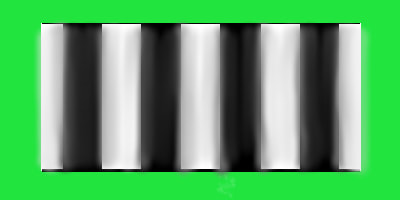
So if this was your original signal pattern (against a green background just so we can clearly see the edges):

If the image had just its phase messed up and contrast remained the same, it could look something like this:

Instead of the image starting at the beginning of the first line pair like in the test pattern, it starts in the middle of the first white block. So if you saw this last image, you would expect the data point on an OTF chart (that represents this particular line spacing) to be a negative number for the Y-axis.
But the OTF would be able to quantify both the shift in the pattern PLUS the blur in contrast (MTF). So the situation you might see below with both MTF showing decreased contrast, and the phase getting messed up, too, can be completely described:
The data point that represents this last one would still be a negative number, because the phase shifted. But taking the absolute value of that number (meaning you ignore the negative sign) would show you the MTF.
There you go!
Matte means not shiny. It’s a rough surface compared to specular mirrors. You won’t be able to see your image in a matte surface. Matte things would also be said to have diffuse reflectance.
